Designing a loyalty system that gives customers a reason to return
Bestway wanted loyalty added to their mobile app. I reframed the question: how do we make loyalty valuable enough that customers actually come back?
Team composition
TL;DR
Problem
Bestway's customers used the app to buy and then left. There was nothing to encourage them to come back between purchases or to reward them for doing so.
What I did
Reframed the brief from 'add loyalty' to a system design problem. Mapped 8 moments across the loyalty lifecycle, reviewed 10+ competitor experiences, explored 3 concept directions, and designed a model that surfaces loyalty value where customers already are.
Impact
Delivered a clear end-to-end loyalty model with a foundation that can grow as the programme adds new offers and mechanics over time.

Customers were not asking for loyalty. They were asking for a reason to come back.
The brief was to add loyalty. The real problem was simpler: customers used the app to buy and then left. Loyalty only works if it is visible enough to change that habit. So I designed for the smallest loop that could do that, not the most complete feature set.

I mapped the system before I mapped the screens.
Understanding how loyalty connected to purchasing, ordering, and account hierarchy shaped every decision that followed. Without that picture, the design would have solved the wrong surface.
Opportunity
Bestway already had a working transactional relationship with its customers. The opportunity was to use the mobile experience to give customers more reasons to return between purchases, without getting in the way of the buying journey that already worked.
Product hypothesis
We believed: Customers were not engaging with loyalty because the value was not visible at the right moments, not because they did not want it.
If we: surfaced loyalty progress within the existing journey rather than hiding it in a separate section,
Then: customers would start to see loyalty as part of how they shop with Bestway, not a separate thing to manage,
Because: when people can see their progress and understand what they are working toward, they are more likely to keep going.
Risks
- Adding too many loyalty features at once would make the experience confusing and harder to understand.
- If redeeming a reward feels harder than earning it, customers will stop trusting the programme.
I wrote a hypothesis before opening Figma.
Framing the problem as a testable belief gave the PM and me a shared definition of what success actually meant. It stopped the project from drifting into 'make it nicer' territory.
Challenge
Who Bestway is
Bestway Wholesale is the UK's largest independent cash-and-carry. They supply independent retailers, caterers, and pet retailers across the UK. Their mobile app is used by business owners who buy in bulk.
The brief was simple: add a loyalty feature to the existing app.
The question I reframed
Instead of asking how to add loyalty, I asked: how do we make loyalty valuable enough that customers actually change their behaviour and come back more often?
That shift turned the work from a feature build into a system design problem. It also meant answering a simple customer question: what is in it for me?
Three business objectives
Working with stakeholders, I translated the feature request into three clear goals: give customers a reason to return between purchases; make earning and redeeming visible enough to become part of normal behaviour; and build a foundation that can grow as new offers are added, without needing a full redesign each time.
Mapping the full journey before designing anything
Before touching any screens, I mapped out the full customer journey: from discovering the programme, joining, making a purchase, earning points, tracking progress, unlocking a reward, redeeming it, and coming back again.
This surfaced something important. The product needed to behave differently depending on where a customer was in that journey. A new customer needs to understand what they are joining. A customer close to a reward needs to feel the pull of that milestone. A customer with an unlocked reward needs a clear path to use it.
I was not designing one loyalty screen. I was designing a system with eight different states, each needing its own message.
↳ This map revealed 8 distinct customer states — each needing different content, messaging, and actions. It became the foundation for every screen decision that followed.
Competitive research
I reviewed 10+ loyalty experiences across retail, grocery, and related categories. I looked at how each handled five things: joining, earning, showing progress, offering rewards, and letting customers redeem.
Three things stood out. Programmes that showed loyalty value close to where customers already were performed better than those that hid it in a separate section. Showing progress toward the next reward was more motivating than showing a points balance with no context. And the programmes where redemption was confusing or slow lost customer trust, even when earning had worked well.

↳ Audit of 10+ loyalty programmes across retail and grocery. The pattern was clear: visibility of progress drove engagement; friction at redemption killed trust.
Design principles
Answer three questions in seconds: What have I earned? How close am I? How do I use it?
Show loyalty where customers already are, not in a section they have to go looking for.
Show progress toward the next reward, not just a points balance with no context.
Make redeeming easier than earning. If using a reward is frustrating, customers stop trying.
Start with the core loop: Earn, Track, Unlock, Redeem. Build everything else later.
Design for different customer states. A new customer needs different information than one who is close to their first reward.
Strategy
Concept direction
Show loyalty in context, not in a separate destination
ShippedWhy: I explored three approaches. A dedicated loyalty section kept things organised but required customers to go looking for it, which most would not do. Surfacing loyalty everywhere in the app risked cluttering the buying experience. The contextual approach showed a lightweight loyalty summary at the right moments, with more detail available when relevant.

Alternatives Considered
- Dedicated loyalty section: easy to organise but easy to miss for customers who do not go looking for it.
- Loyalty everywhere in the app: high visibility but risks getting in the way of the core buying experience.
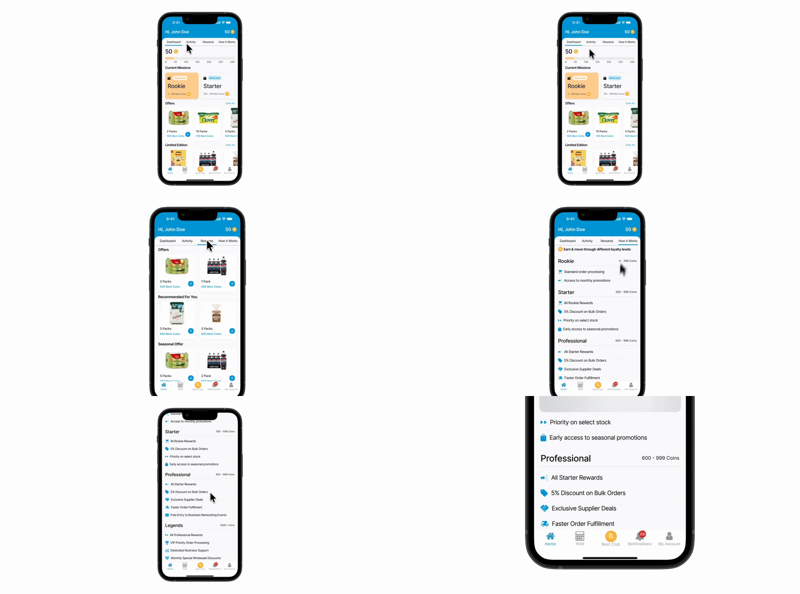
- Loyalty progress appears at moments that are already meaningful to the customer, not in a separate tab
- More detailed information is shown only when it becomes relevant to what the customer is doing
- The structure can support future loyalty features without rebuilding the layout
Result: The contextual approach gave loyalty the best chance of being noticed and used, without competing with the buying experience customers were already in the app for.
Trade-off: Getting the placement right takes judgment. Too many points where loyalty appears becomes noise. Too few and customers miss it.
Business reasoning: A loyalty section customers have to find puts the work on marketing. Loyalty that appears at the right moment does the work itself.
Scope decision
Start with four core actions, not every possible feature
ShippedWhy: There were many loyalty features we could have built: multiple reward types, personalised offers, a detailed loyalty history, gamification. Adding everything at once would have made the experience hard to understand and harder to build. Starting with the core loop gave customers something clear to engage with first.

- Scope reduced to four interactions: Earn, Track, Unlock, Redeem
- Additional features mapped as future additions, not immediate requirements
- Interaction patterns built to support those future additions without needing to redesign
Result: A loyalty experience customers could understand quickly, built on a structure that could grow without starting over.
Trade-off: Starting small means some use cases are not covered at launch. The bet was that a simple programme customers actually use is worth more than a complete one they ignore.
Business reasoning: A loyalty programme that customers understand and engage with creates real business value. A complex one that confuses them does not.
System design
Design for each customer state, not one generic screen
ShippedWhy: The journey mapping made it clear that a customer who just signed up has completely different needs to one who is about to unlock their first reward. A single static loyalty screen would treat them the same and serve neither well.

- 8 customer states identified, from new and not enrolled through to reward redeemed
- The interface shows different content and messaging depending on where the customer is
- Progress is shown relative to the next reward, not as a standalone number
Result: Each customer sees information that is relevant to where they actually are, rather than having to figure out what a generic screen means for them.
Trade-off: Designing for multiple states takes more time than designing one screen. Each state needs its own layout, content, and edge cases.
Business reasoning: The moment a customer is close to a reward is when they are most likely to act. If the interface does not surface that moment clearly, the opportunity is lost.
Stakeholder validation
Show stakeholders the trade-offs, not just one solution
ShippedWhy: Instead of presenting one polished proposal, I brought all three concept directions to stakeholders. This moved the conversation from preferences about how things looked to decisions about what customer behaviour each direction would create.

- Three directions presented with clear trade-offs, not a single recommendation
- Feedback focused on outcomes and customer behaviour rather than visual choices
- Multiple rounds of iteration refined the scope, the information hierarchy, and how progress was communicated
Result: Stakeholders made shared decisions rather than approving a proposal they had not been part of shaping. That meant stronger alignment and fewer changes late in the process.
Trade-off: This takes longer than presenting one solution. But the decisions made this way tend to stick.
Business reasoning: Loyalty programmes often fail at the delivery stage when the business has not been involved in the design trade-offs. Getting alignment early avoids that.
Concepts explored
Three directions, one decision. Click each concept to see what we built, why we built it, and why we moved on.
What we designed
A dedicated loyalty destination. All points, rewards and programme information lived in one separate section of the app.
Why we moved on
Clean to organise but invisible to customers who did not actively go looking for it. Most users would never find it.
I showed all three directions to the PM, not just the one I preferred.
Presenting the discarded concepts alongside the final direction made the rationale visible. The PM understood the trade-offs and the decision felt shared, not handed down.
Testing with real customers

When the prototype felt solid enough to test, I shared a Figma link in a video call with a Bestway customer named Lily. No formal script. Just three tasks, a screen share, and a genuine question: does this make sense to you? I wanted to watch, not guide.
I focused the session on three journeys I knew the team had disagreed about: understanding your purchase power, joining the rewards club, and making sense of your points. Those were the areas where internal opinion was loudest and real customer behaviour was least known. Testing them first made the most sense.

About ten minutes in, Lily paused on the rewards dashboard and said something I did not expect. She looked at her points balance and asked, 'OK so what am I supposed to do with this?' That was the moment. Not confusion about the interface. Confusion about the next step. The number was visible but the action it should prompt was not.
I brought that clip straight to the PM. We had been debating whether to add more data to the dashboard. This changed the question entirely. The issue was not information density. It was that nothing was connecting the balance to a reason to act. We redesigned around that, adding contextual cues tied to specific offers and actions. It was a small shift in layout but a big shift in how the whole system read.
User feedback changed a core assumption.
Customers did not just want a points balance. They wanted the balance to tell them what to do next. That reframing drove the contextual loyalty design and is the most important thing testing gave us.
Business impact
Design impact
- Reviewed 10+ loyalty experiences across retail and grocery to understand what works and what does not.
- Mapped 8 moments across the customer loyalty journey to identify what the product needed to handle.
- Explored 3 concept directions and validated the approach with stakeholders before committing.
- Focused the design on 4 core interactions: Earn, Track, Unlock, Redeem.
Strategic impact
- Turned a feature request into a clear loyalty model with defined business and customer goals.
- Built a structure that can support new offers and mechanics as the programme grows, without needing a redesign.
- Created a shared language between design and the business for evaluating loyalty decisions going forward.
Process & visuals
Results
What the research changed
I went in expecting to find best practices to follow. What I found instead were the failure patterns: programmes where the value was buried, where a points balance was shown with no context, and where redeeming was so difficult that customers gave up and left earned value unused.
That shifted the entire focus from adding features to making the value visible and the experience easy to use.
A framework that helped with stakeholder conversations
One of the most useful things to come out of the alignment work was a simple framework connecting customer goals to business goals to product decisions to success signals. It gave every stakeholder conversation a shared starting point. Instead of debating whether to include a feature, we could ask: what customer behaviour does this create, and does that behaviour produce the result the business needs?
What I would do differently
The most important thing I did was map the full customer journey before opening Figma. Without that, I would have designed for a single typical customer state and missed what the system actually needed to handle.
I would also push earlier to agree on what success looks like in measurable terms. We had a clear direction but not specific targets. Having numbers for activation, engagement, and redemption from the start would have made it easier to validate the design decisions as we went.