High-Conversion Checkout Experience
High-Conversion Checkout Experience
SonyLIV’s checkout needed to support India’s diverse payment habits, without sacrificing speed or trust.
SonyLIV’s checkout needed to support India’s diverse payment habits, without sacrificing speed or trust.
Role: Product Designer (End-to-end)
Platform: Mobile
Team: PM, PO, 3 Engineers
2 months
0%
0%
Increased UPI adoption
0%
0%
Increased UPI adoption
0%
0%
Increased UPI adoption
0%
0%
Reduced failed payments
0%
0%
Reduced failed payments
0%
0%
Reduced failed payments
0%
0%
Reduced checkout time
0%
0%
Reduced checkout time
0%
0%
Reduced checkout time
TL;DR
TL;DR
TL;DR
Problem
Problem
Checkout had too many competing options and trust gaps, leading to hesitation and failed payments at the most conversion-critical moment.
Checkout had too many competing options and trust gaps, leading to hesitation and failed payments at the most conversion-critical moment.
What I did
What I did
I simplified decision-making, prioritised high-success payment paths, and redesigned failure/retry states so users always knew what to do next.
I simplified decision-making, prioritised high-success payment paths, and redesigned failure/retry states so users always knew what to do next.
Impact
Impact
+0%
+0%
+0%
+0%
+0%
+0%
UPI adoption
-0%
-0%
-0%
-0%
-0%
-0%
Failed payments
-0%
-0%
-0%
-0%
-0%
-0%
Time to complete
Context
Context
Context
SonyLIV supports a wide range of payment methods… UPI, cards, wallets, netbanking, and partner offers, because users across India have different preferences. That variety is necessary, but it also increases complexity.
In high-traffic moments (new releases, sports, promotions), checkout becomes a bottleneck: even small friction can cost meaningful revenue and retention.
UPI adoption
Choose subscription plan
Payment
Select method -> Apply Offer -> Pay
Confirmation
Success Rate -> Receipt/Next Steps
The Problem
The Problem
The Problem
The existing checkout didn’t feel hard because payment is hard, it felt hard because the experience created unnecessary uncertainty.
The existing checkout didn’t feel hard because payment is hard, it felt hard because the experience created unnecessary uncertainty.
What was happening
What was happening
Users had to think too much at the moment they wanted to pay.
Some screens didn’t provide enough clarity about what happens next.
When payments failed, recovery wasn’t always calm, obvious, and guided.
Users had to think too much at the moment they wanted to pay.
Some screens didn’t provide enough clarity about what happens next.
When payments failed, recovery wasn’t always calm, obvious, and guided.
Why it mattered
Why it mattered
In payments, hesitation is expensive. If users don’t feel confident, they either abandon, switch apps, or try again later (often never returning).
What I did
What I did
I simplified decision-making, prioritised high-success payment paths, and redesigned failure/retry states so users always knew what to do next.
I simplified decision-making, prioritised high-success payment paths, and redesigned failure/retry states so users always knew what to do next.

Before: too many options competing for attention created hesitation and slower completion.
Goals & Success Metrics
Goals & Success Metrics
I framed the redesign around measurable outcomes, so we weren’t just “making it look better” — we were improving conversion reliability.
I framed the redesign around measurable outcomes, so we weren’t just “making it look better” — we were improving conversion reliability.
Goals
Goals
Make checkout feel faster by reducing decisions per step
Increase trust and clarity (especially around offers and totals)
Reduce failed payments by improving states and recovery guidance
Encourage successful methods like UPI without removing user choice
Make checkout feel faster by reducing decisions per step
Increase trust and clarity (especially around offers and totals)
Reduce failed payments by improving states and recovery guidance
Encourage successful methods like UPI without removing user choice
How we measured success
How we measured success
UPI adoption rate
Failed payment rate
Time-to-complete checkout
Post-purchase satisfaction signal (as available)
UPI adoption rate
Failed payment rate
Time-to-complete checkout
Post-purchase satisfaction signal (as available)
What I Learned (Insights that shaped the design)
What I Learned (Insights that shaped the design)
To ground decisions, I combined:
Heuristic evaluation to spot friction patterns
Benchmarking from Prime Video, Hotstar, PhonePe, Paytm and similar products
Payment UX principles: trust, clarity, error prevention
Behavioural patterns in Indian digital payments (UPI preference, speed expectations)
To ground decisions, I combined:
Heuristic evaluation to spot friction patterns
Benchmarking from Prime Video, Hotstar, PhonePe, Paytm and similar products
Payment UX principles: trust, clarity, error prevention
Behavioural patterns in Indian digital payments (UPI preference, speed expectations)
Key Insights
Key Insights
People don’t want more choice — they want the right choice to feel obvious.
Trust is built through transparency: clear totals, clear offer logic, clear steps.
Failure is part of payments — recovery must feel guided, not scary.
People don’t want more choice — they want the right choice to feel obvious.
Trust is built through transparency: clear totals, clear offer logic, clear steps.
Failure is part of payments — recovery must feel guided, not scary.

Benchmarks showed consistent patterns: reduce choice overload, increase clarity, design recovery.
Key Decisions
Key Decisions
Decision 1: Make UPI the easiest path (without forcing it)
Decision 1: Make UPI the easiest path (without forcing it)
Why
Why
UPI is familiar and fast for many users, and it has high adoption potential. If we make it the smoothest path, users complete faster without feeling pushed.
UPI is familiar and fast for many users, and it has high adoption potential. If we make it the smoothest path, users complete faster without feeling pushed.
What changed
What changed
UPI surfaced more clearly in the hierarchy
Shortened the path from selection → payment initiation
Reduced competing noise around it
UPI surfaced more clearly in the hierarchy
Shortened the path from selection → payment initiation
Reduced competing noise around it
Result
Result
UPI adoption increased by 28%.
UPI adoption increased by 28%.

We prioritised UPI visually and structurally to reduce decision time.
Decision 2: Reduce choice overload with clearer hierarchy
Decision 2: Reduce choice overload with clearer hierarchy
Why
Why
When everything looks equal, users slow down. Payment is a moment where confidence matters more than exploration.
When everything looks equal, users slow down. Payment is a moment where confidence matters more than exploration.
What changed
What changed
Grouped payment methods logically
“Recommended / most used” sits first
Long-tail options remain available but not dominant
Grouped payment methods logically
“Recommended / most used” sits first
Long-tail options remain available but not dominant
Result
Result
Checkout time reduced by 21%.
Checkout time reduced by 21%.
Hierarchy reduces thinking, users move forward with confidence.
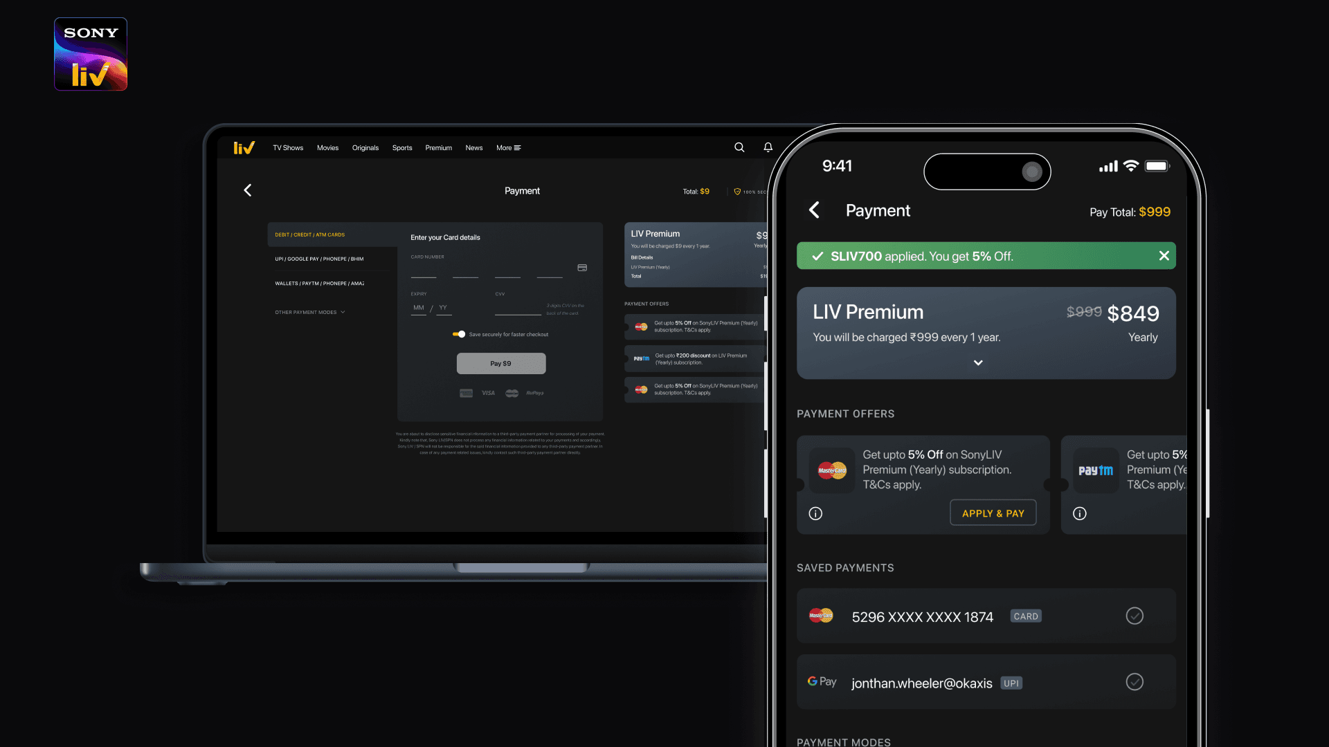
Decision 3: Make offers feel effortless, not risky
Decision 3: Make offers feel effortless, not risky
Why
Why
Offers can improve conversion, but unclear offers create mistrust: users hesitate if they don’t understand whether it applied or what changed.
Offers can improve conversion, but unclear offers create mistrust: users hesitate if they don’t understand whether it applied or what changed.
What changed
What changed
Clear “applied” state
Eligibility explained in plain language
Total cost always visible and consistent
Clear “applied” state
Eligibility explained in plain language
Total cost always visible and consistent
Expected outcome
Expected outcome
Higher confidence → fewer drop-offs during offer selection.
Higher confidence → fewer drop-offs during offer selection.
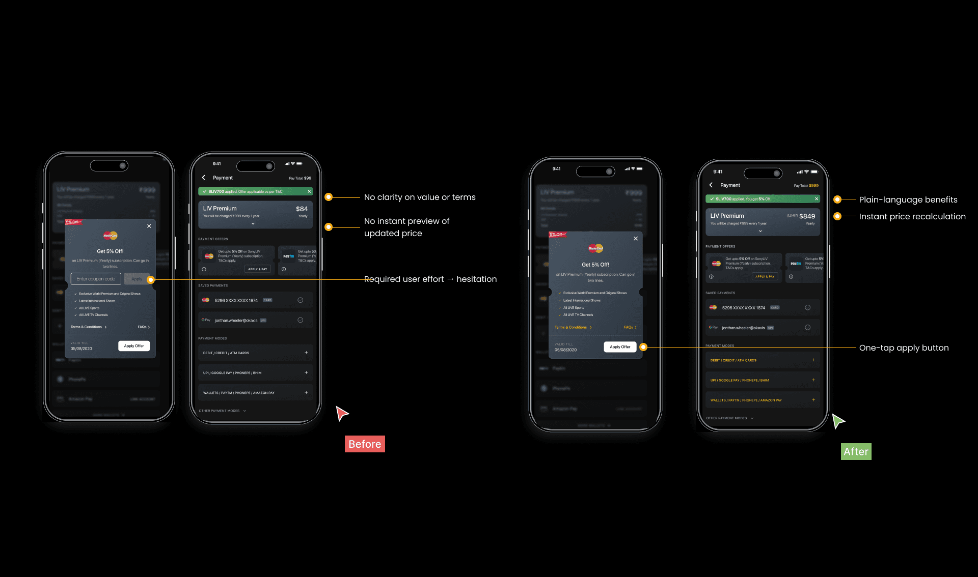
Offer clarity builds trust — users don’t feel surprised at the last step.
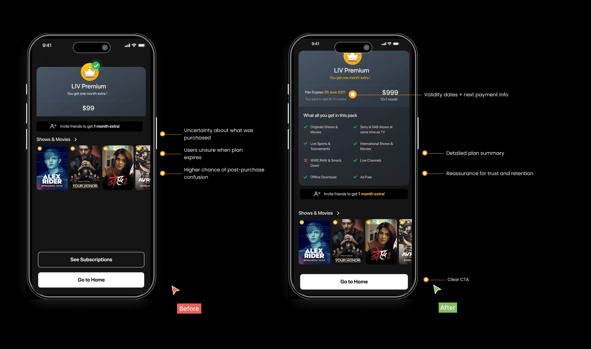
Decision 4: Design for failure recovery (because payments fail)
Decision 4: Design for failure recovery (because payments fail)
Why
Why
A failed payment is emotionally charged. If the next step isn’t obvious, users abandon.
A failed payment is emotionally charged. If the next step isn’t obvious, users abandon.
What changed
What changed
Calm failure messaging
Clear retry path
Smart fallbacks (choose another method without restarting everything)
Calm failure messaging
Clear retry path
Smart fallbacks (choose another method without restarting everything)
Result
Result
Failed payments reduced by 14%.
Failed payments reduced by 14%.

Recovery is part of the product — we designed it to feel safe and guided.
Solution Walkthrough (the story flow)
Solution Walkthrough (the story flow)
What I Learned (Insights that shaped the design)
What I Learned (Insights that shaped the design)
To ground decisions, I combined:
Heuristic evaluation to spot friction patterns
Benchmarking from Prime Video, Hotstar, PhonePe, Paytm and similar products
Payment UX principles: trust, clarity, error prevention
Behavioural patterns in Indian digital payments (UPI preference, speed expectations)
To ground decisions, I combined:
Heuristic evaluation to spot friction patterns
Benchmarking from Prime Video, Hotstar, PhonePe, Paytm and similar products
Payment UX principles: trust, clarity, error prevention
Behavioural patterns in Indian digital payments (UPI preference, speed expectations)
Key Insights
Key Insights
People don’t want more choice — they want the right choice to feel obvious.
Trust is built through transparency: clear totals, clear offer logic, clear steps.
Failure is part of payments — recovery must feel guided, not scary.
People don’t want more choice — they want the right choice to feel obvious.
Trust is built through transparency: clear totals, clear offer logic, clear steps.
Failure is part of payments — recovery must feel guided, not scary.
Benchmarks showed consistent patterns: reduce choice overload, increase clarity, design recovery.
Impact
Impact
+28%
UPI Adoption
UPI was surfaced as the easiest path (Decision: UPI first)
-14%
Failed Payments
Clear error states + retry reduced drop-offs
(Decision: guided recovery)
+21%
Time to complete
Hierarchy reduced choices and sped decisions.
(Decision: method hierarchy)
Learnings & What I’d Improve Next
Learnings & What I’d Improve Next
Learnings
Learnings
Payment UX succeeds when the experience reduces doubt more than it reduces steps.
Designing error recovery is as important as designing the happy path.
Payment UX succeeds when the experience reduces doubt more than it reduces steps.
Designing error recovery is as important as designing the happy path.
Next improvements
Next improvements
Run A/B tests for payment hierarchy and offer placement
Expand instrumentation for drop-offs per method
Improve accessibility and performance under peak traffic
Run A/B tests for payment hierarchy and offer placement
Expand instrumentation for drop-offs per method
Improve accessibility and performance under peak traffic